I’ve got the blues!
Well, who hasn’t during this Lockdown time? Hang on, though! I’m not going to dwell on that just now. No! This is all about the colour blue. Next to cool greys and tranquil shades of teal, blue is just about my favourite colour.
So much to choose from …
It’s just overwhelming to see the huge range of blues that are currently available in watercolours, pencils and inks. I usually end up with as many blues and greys as I can – I can’t have enough! Like most people though, I’m drawn to my own favourites: those deep purplish blues like Dark Indigo and rich Prussian Blue, as well as dusky blue-grey shades like Gunmetal and Payne’s Grey.
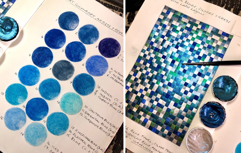
Putting together shades of blue using coloured pencils & pearl watercolours
Precious Blue
There was a time when the pigment blue was more precious than gold! Ultramarine blue, by its very name (ultra beyond, mare the sea), indicated that its origins were in faraway lands. Afghanistan was where the semi-precious stone lapis lazuli was mined and from this, blue pigment was extracted and prepared for artists to use. It was very rare and costly, reserved only for wealthy patrons and for sacred art. Renaissance artists kept this precious pigment for the Virgin Mary’s robes, for example. Thankfully, today we have synthetic and more affordable blue. French Ultramarine, with a huge range of other blues, is part of every artist’s palette.
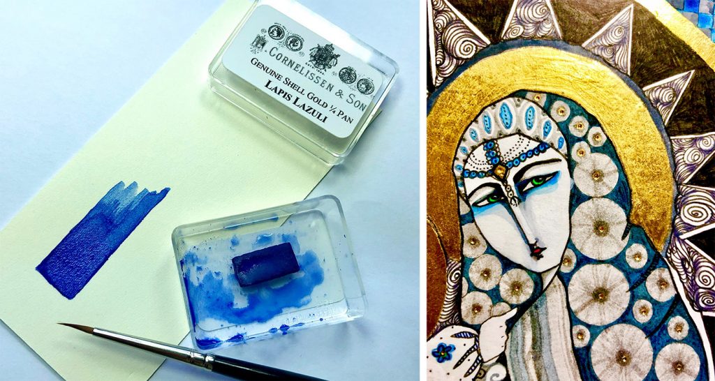
Lapis lazuli watercolour has a chalky quality. Part of my Madonna artwork using blue shades & rich gold.
Traditional Blue
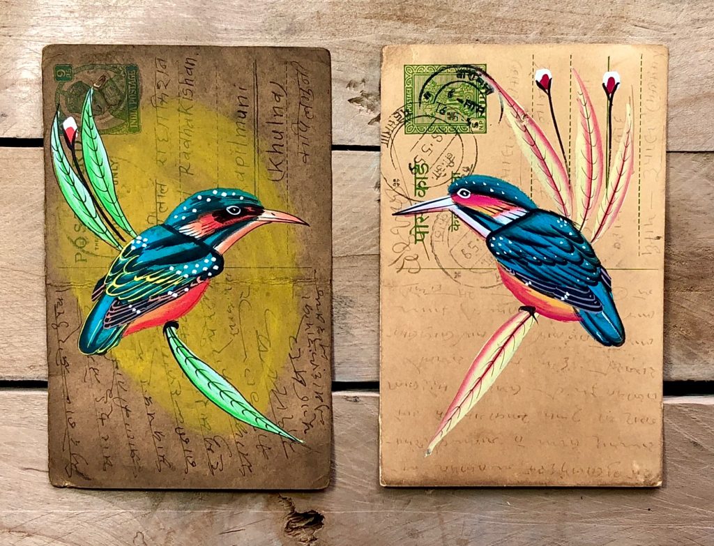
Indian miniature art traditionally shows familiar themes of brightly coloured exotic birds and animals with sumptuously robed people. Vivid lapis lazuli blue was often used for royal characters or deity. Today, the folk art from India continues these traditional themes with bright gouache paint. I have collected a few of these miniature paintings from the Rajasthan area (below) & love the deep earthy effect of the blue gouache used on these vibrant kingfishers’ wings.
Indian folk art: bright earthy gouache brings out the eye-catching blue of the kingfishers’ wings
Plant Blue
The leaves of the indigo plant were used traditionally in Malaysia and Japan to produce a deep blue dye for cotton. This has been largely replaced today by chemically produced dyes but many of the old methods and designs used in dyeing cotton are still practiced. Boroboro is the name for Japanese indigo-dyed cotton patches used in the past to repair old, worn clothing. With today’s world looking more towards recycling, this old Boro-inspired custom is becoming quite trendy!
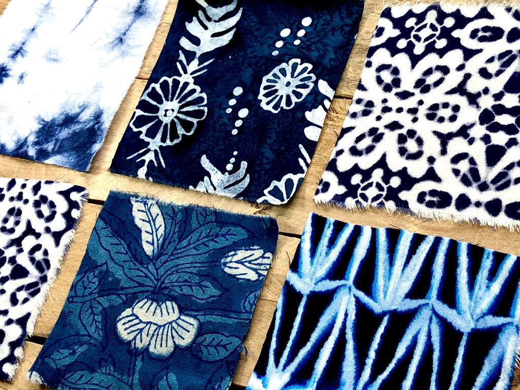
Boro-inspired indigo hand-dyed patches of cotton
Butterfly Blue
In the Good Ol’ Days before Lockdown, a great place to spend a summer afternoon was the Butterfly Jungle at Hall Place, Bexley. I was completely dazzled by the exotic butterflies flying freely around me and seeing those brilliantly coloured wings up so close! A favourite was of course, the blue Morpho. But hang on one minute… I have since learned that the blue of the butterfly’s wings is NOT the actual colour blue! Sorry? Seems it is a reflection of the light on all the little scales that exist upon the surface of the creature’s wings. OK. Well, I still love its scintillating blue-coloured wings, reflective scales or not.
I simply cannot forget another favourite blue butterfly & that is the little British Holly Blue. It’s not exotic & it may not dazzle you but its wings have a subtle powdery blue that are almost silvery grey. Exquisite.
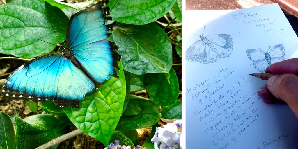
Dazzling Blue Morpho butterfly & outdoor sketches of the familiar Holly Blue
Inspirational Blue
Of all the colours I use in my art, I am inspired by blue. It is very variable, covering a vast range of hues, tones, shades and even moods. I don’t see it as being linked to low or depressed spirits, but perhaps more to mystery and hidden depths. Blue has so much potential and scope when used to create art.
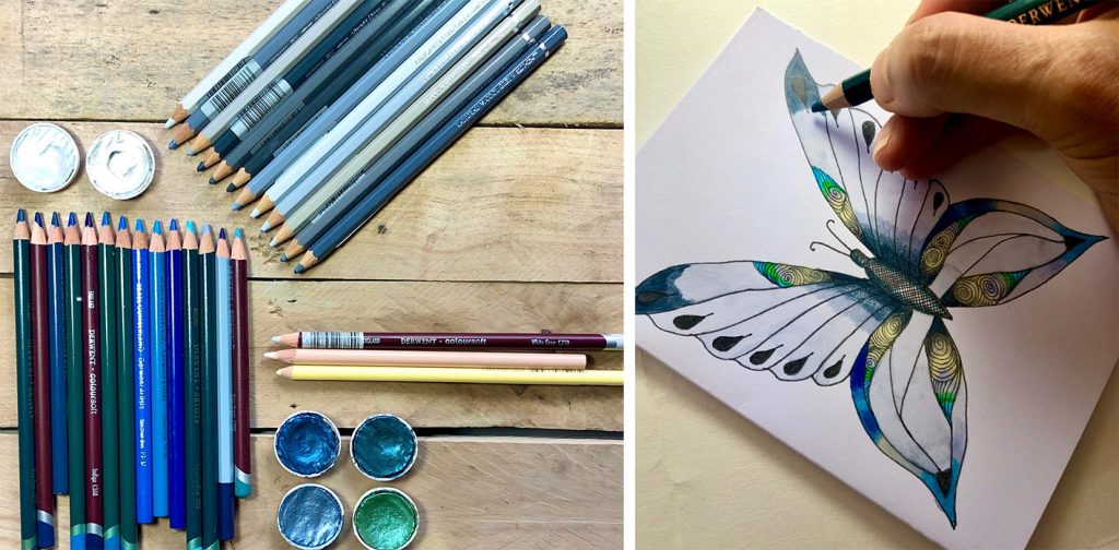
Finding inspiration from shades of blue
If I put a vast spectrum of blues alongside a wide range of greys, then add some sparkling pearl blues and shimmering silver watercolours, I have a perfect palette for an illustration. Or an exotic imaginary butterfly. Just like this one:
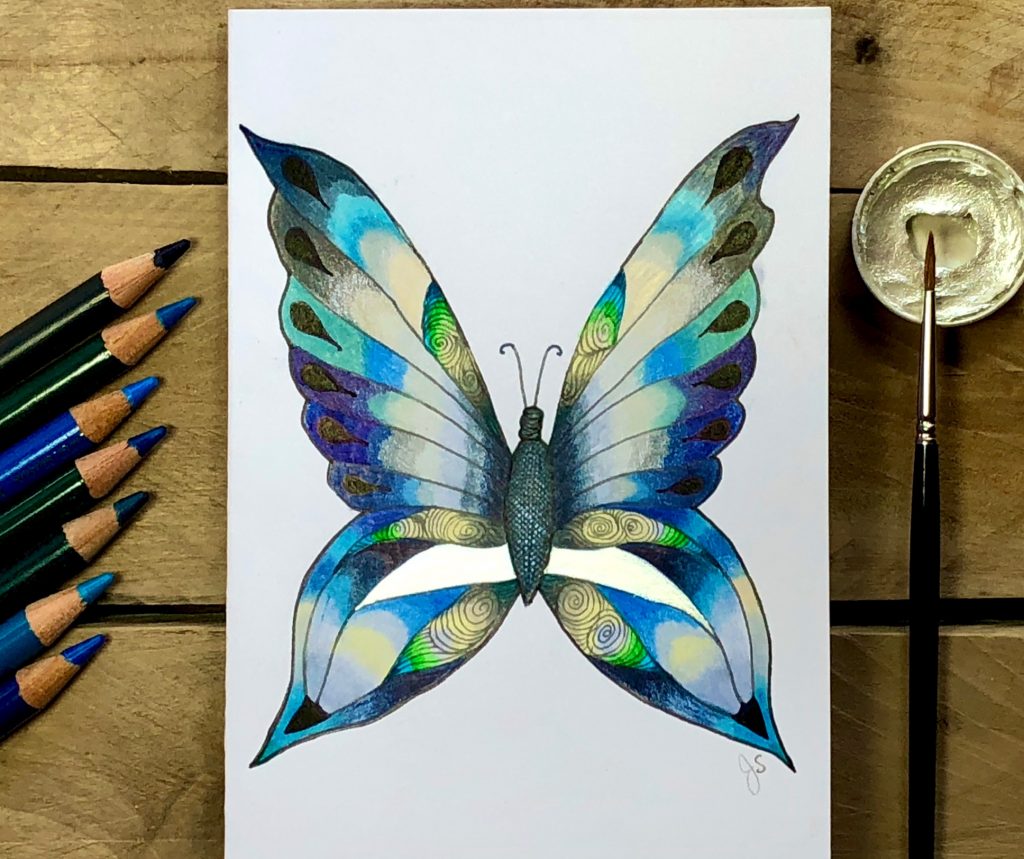
The Hope Butterfly
I called this artwork The Hope Butterfly. Butterflies are, for me, emblems of a brighter future. Right now, I think we are all hoping for brighter days to come. Some of the subtle shades of blue balanced with those brighter flashes of blue and silver carry the mood we are all feeling: some light is popping out of the darkness. Hope is ahead ...


